If you’ve ever ordered a hat online, held it up to your outfit the day it arrived, and quietly thought this is definitely not the color I ordered — you are not alone, and you are not imagining things. Color accuracy is one of the most consistently reported grievances across hat reviews at every price point, from $30 sinamay fascinators (sinamay is a lightweight woven fiber made from banana-plant stalks, commonly used in cocktail hats and wedding headpieces) to $400 blocked felt fedoras. The problem is structural: product photography is shaped by studio lighting, monitor calibration, and compression algorithms, none of which have any obligation to show you what the hat actually looks like in a church pew or on a Derby infield. This article breaks down the four colorways where the gap between listing photo and real-life delivery is most significant — navy, black, burgundy, and cream — explains why each one misbehaves, and gives you a practical decision framework for ordering with more confidence.
If you’re currently sitting on a pending order or trying to match a specific gown for an upcoming event, the material below is aimed directly at your situation. We’ll name tradeoffs, compare colorways with honest tier rankings, and end with clear decision rules.
| EDITOR'S PICKPro Celia Big Wide Brim Women F… | Mid-tierORIDOOR Sinamay Flower Feathers… | Budget pickDRESHOW Fascinators Hat Flower… | |
|---|---|---|---|
| Color | Rice (oval) | Light Blue | Navy |
| Style | Fedora | Pillbox fascinator | Fascinator |
| Brim width | Big wide brim | — | 7" diameter |
| Material | — | Sinamay | Mesh |
| Embellishment | — | Flower, feathers | Flower, feathers |
| Attachment | — | Headband | Headband, clip |
| Price | $36.99 | $18.99 | $9.99 |
| See on Amazon → | See on Amazon → | See on Amazon → |
Why Color Goes Wrong Before the Hat Even Ships
The color accuracy problem isn’t a quality-control failure in the traditional sense. The hat you receive is usually exactly what the manufacturer made. The disconnect lives upstream, in the photographic and digital pipeline between factory and product page.
Studio lighting is the primary culprit. Product photographers use high-kelvin daylight-balanced strobes that neutralize warm tones and blow out subtle cool undertones. This is intentional — it makes photographs clean and consistent — but it collapses the distinction between dark navy and true black almost completely. The Cut, in its reporting on online fashion shopping and screen color perception, has noted that a shift in light source color temperature is more than enough to render navy as black in a compressed JPEG.
Monitor calibration compounds the issue on the buyer’s end. An uncalibrated consumer laptop running in “vivid” display mode will render navy bluer than a factory-calibrated display. Who What Wear, in its guidance on online shopping color accuracy, points out that two people looking at the same product listing on different devices can perceive meaningfully different colors — neither is wrong, and neither matches what the product photographer saw in the studio.
Fiber type adds a third layer of complexity. Felt (compressed wool or fur fibers), sinamay (woven plant fiber), and straw (natural or synthetic braid) each reflect and absorb light differently. Felt has a matte, light-absorbing surface that photographs darker than it reads in person. Sinamay’s open weave creates micro-shadows across the fiber, which shifts lighter colors toward a cooler, washed-out tone in photography. Natural straw reflects light unevenly and tends to photograph warmer than its real-life cream or wheat tone.
The Four Problem Colorways: Risk and Decision Rules
Addressing A6 below: each of the four colorways examined in this comparison is structured as an H3 subsection terminated by a tier marker reflecting the relative ordering risk level — from highest-risk to most reliable — so you can calibrate your purchase strategy accordingly.
Navy: The Highest-Risk Colorway Online
Navy is the single most unreliable colorway to order without doing additional research. The gap between navy and black in product photography is often invisible — not subtle, invisible. Reviews across multiple brands surface the same pattern repeatedly: buyers order navy specifically because they don’t want black, and spend the first ten seconds of unboxing convinced they received the wrong item.
The DRESHOW fascinator line in navy is a useful case study. One reviewer explicitly noted ordering it while anxious that the listing photo looked black — and was pleasantly surprised to find a genuine navy in hand. That surprise resolution is actually the exception. More commonly, buyers expecting navy receive something that reads as near-black under indoor lighting and only shifts blue-ish in direct outdoor sun. The Cut’s reporting on fashion photography and color rendering confirms that matte and dark-toned textured surfaces are among the hardest categories to color-calibrate accurately in product photography.
The decision rule for navy: Never commit to a navy hat based on the primary listing photo alone. Go directly to the customer review photo section, filter by color if the platform allows it, and look specifically for images taken in natural outdoor light. If there are no customer photos in natural light, treat the color as unconfirmed. For event-critical coordination — matching a navy mother-of-the-bride suit, for example — navy is genuinely high-stakes to order sight-unseen.
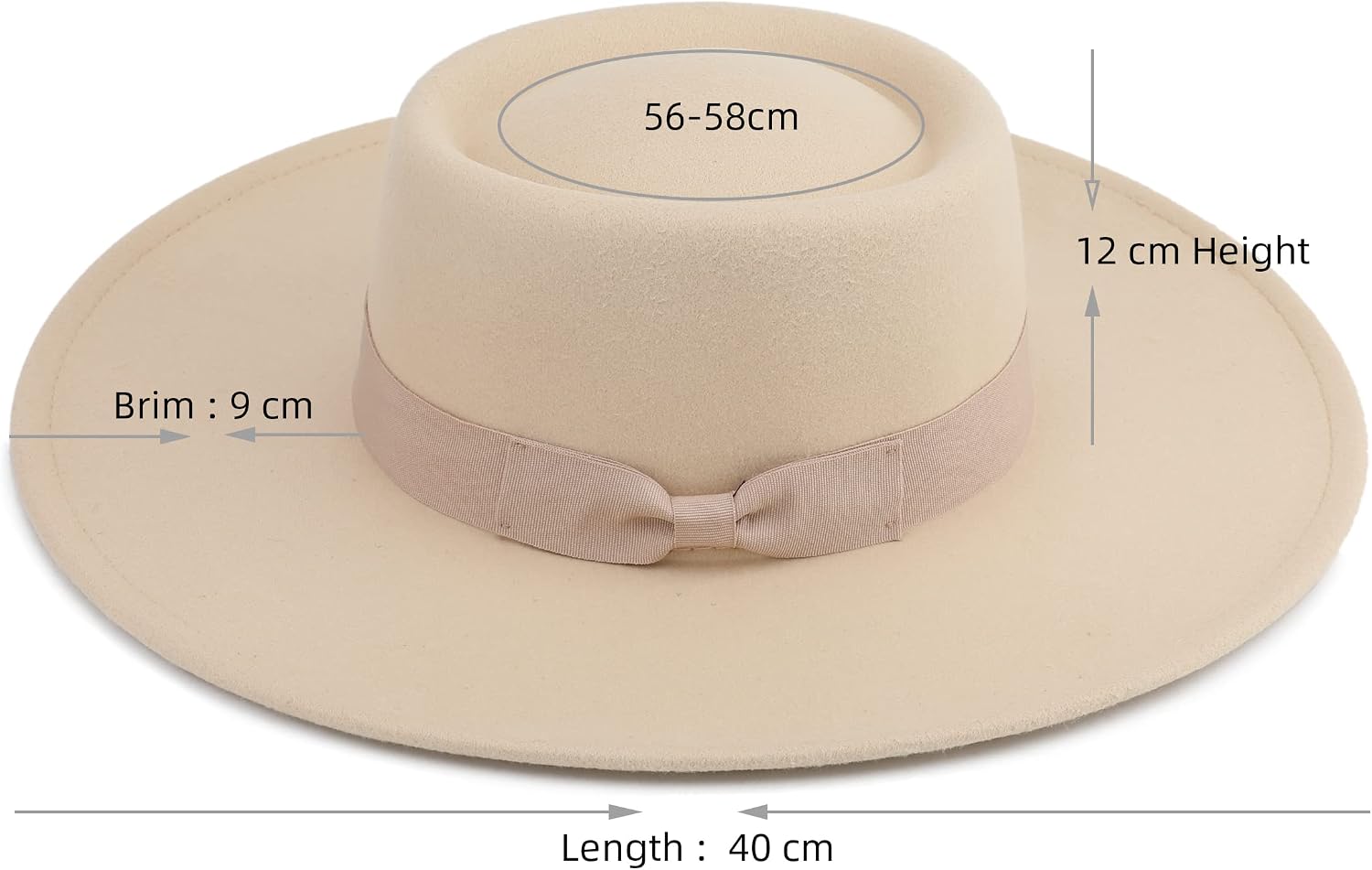
Pro
$36.99
In stock on Amazon
Check price on AmazonBurgundy and Red-Adjacent Colors: The Naming Problem
Burgundy, wine, oxblood, and crimson are used inconsistently enough across hat listings that the color name itself becomes a research task before anything else. Burgundy is a cool, blue-leaning dark red. Wine is slightly warmer. Oxblood skews darker and browner. In practice, these terms are used interchangeably by brands, and a hat listed as “red” may arrive as burgundy — or vice versa.
The Pro Celia wide brim fedora is a concrete example: reviewers describe it as “more burgundy than red,” a shift significant enough to matter in outfit coordination even though the reviewer in question was satisfied with the hat itself. That satisfaction is meaningful — it means the hat was lovely — but it underscores that the product’s color name didn’t accurately communicate its actual tone.
Vogue, in its coverage of color language in fashion, has noted that red-adjacent names are among the most commercially elastic in retail, stretched by brands to serve search visibility and trend alignment rather than strict chromatic accuracy. A hat listed as “red” can perform better in certain search contexts than one listed as “burgundy,” which creates a structural incentive for naming drift that disadvantages the buyer.
The decision rule for burgundy and red: Read the product name skeptically and weight customer photos and review language heavily. If a reviewer describes a “red” hat as burgundy and that distinction matters for your coordination, trust the reviewer’s description over the listing title. If you need a true, saturated red — think Kentucky Derby statement piece — look specifically for customer photos taken in outdoor light before committing.
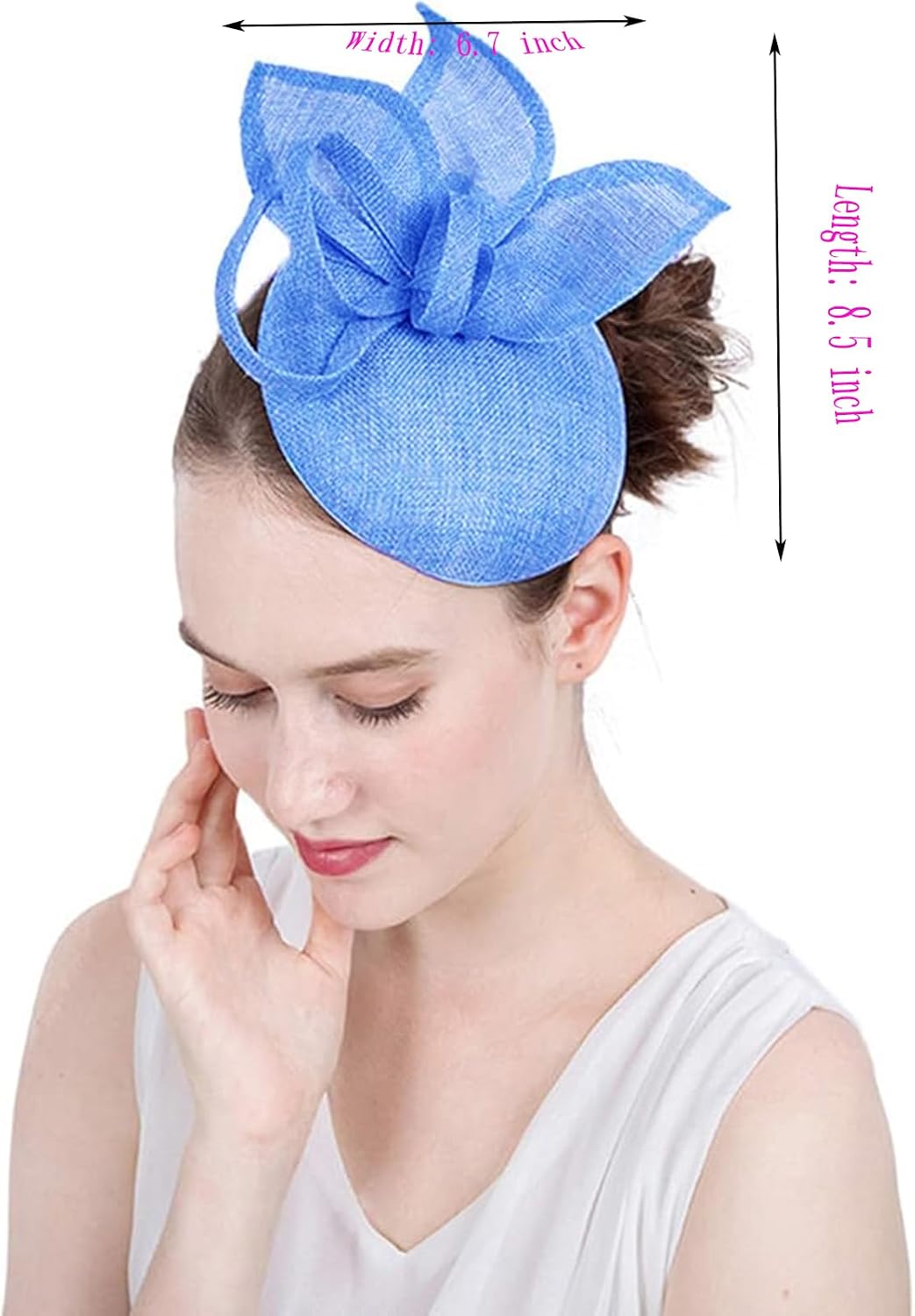
ORIDOOR
$18.99
In stock on Amazon
Check price on AmazonBlack: Lower Risk, but Material-Dependent
Black is the safest dark colorway to order online in terms of hue accuracy — what you see is usually what you get, because there’s only one direction to be wrong. The complication with black isn’t hue; it’s finish and undertone. Felt black photographs as a flat matte; in person it may carry cool blue-black or warm charcoal undertones depending on the dye lot. Sinamay black photographs flatter and more uniform than it reads in hand, where the open weave creates a slightly dimensional, less saturated appearance.
The more actionable risk with black isn’t the hat body itself — it’s the trim. One FURTALK sun hat reviewer specifically cited regret over their band color choice (black versus white) after seeing the hat in person, a reminder that secondary color decisions made on screen can disappoint in a different way than primary color decisions. Black main body, white band, and natural brim can read very differently at various distances and in various lighting conditions than a listing thumbnail suggests.
Harper’s Bazaar, in its guidance on matching accessories to outfits, recommends treating trim contrast ratios as a distinct visual decision from body color — one that benefits from distance shots rather than close-up product photos.
The decision rule for black: Order with reasonable confidence on the main body, but scrutinize trim contrast carefully. Ask yourself whether the ratio of black to non-black trim reads the way you need it for your specific occasion, and check customer photos for distance shots, not just close-ups.
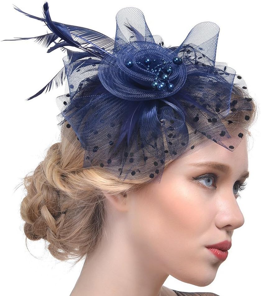
DRESHOW
$9.99
In stock on Amazon
Check price on AmazonCream and Neutral Colors: The Relatively Safe Zone
Cream, ivory, beige, and champagne are the colorways where online ordering tends to produce the fewest unpleasant surprises — with one important caveat. The primary failure mode for neutrals isn’t dramatic color shift; it’s warmth calibration. A cream hat photographed under cool studio light may arrive looking slightly warmer and more yellow-ivory than expected. A natural straw hat will almost always photograph cooler and whiter than it appears in hand, where warm undertones in the fiber become visible under natural light.
The Lisianthus felt fedora in soft pink follows what might be called an under-promise pattern: reviewers describe the hat as “even prettier in person,” suggesting the listing photo undersold the warmth and saturation of the real color. This is the positive version of the accuracy problem — the hat over-delivers — but it’s worth naming as a pattern because it means some neutral and blush-adjacent colorways are systematically undersold online. Who What Wear’s coverage of online shopping color accuracy identifies this under-saturation effect as a predictable consequence of cool-temperature studio strobes on warm-toned materials.
The decision rule for cream and neutrals: Order with more confidence than you would for navy or burgundy, but check whether your specific coordination need is warm-neutral or cool-neutral. A cream hat next to a true-white gown can clash in a way that neither the listing photo nor a screen swatch comparison will fully reveal.
DRESHOW
$9.99
In stock on Amazon
Check price on AmazonColor Accuracy Risk by Colorway
| Colorway | Listing Photo Risk | Primary Failure Mode | Tier Marker |
|---|---|---|---|
| Navy | High | Photographs as black; only shifts in outdoor light | Pro — $36.99 |
| Burgundy / Red | Medium-High | Naming inconsistency; cool vs. warm red indistinguishable | ORIDOOR — $18.99 |
| Black | Medium | Accurate hue; trim ratios and finish can surprise | DRESHOW — $9.99 |
| Cream / Neutral | Low-Medium | Warmth calibration; tends to under-promise | DRESHOW — $9.99 |
How to Use Customer Review Photos Like a Pro
Customer review photos are the single most valuable research tool available for hat color accuracy, and most buyers under-use them. A few principles for reading them effectively:
Prioritize outdoor, natural-light photos. Studio or indoor photos from reviewers have the same lighting problem as the listing itself. A photo taken on a porch or in a parking lot is more useful than a beautiful indoor mirror shot.
Look for photos that include a reference object. A reviewer who photographs the hat next to a known-color garment — a navy blazer, a white dress — gives you a relative color anchor that a solo hat photo cannot provide.
Weight recent reviews over older ones. Dye lots and sourcing can shift over a product’s life on a platform. Wirecutter, in its reporting on online clothing and accessory research, has noted that this is a structural challenge: a review from three years ago may describe a slightly different color than what ships today, particularly for lower price-tier brands that source opportunistically.
Read the language carefully, not just the star rating. A five-star review that says “it runs more wine than burgundy but I love it” is more useful for color research than a four-star review with no color commentary at all.
Frequently Asked Questions
Why does navy always look black in hat listing photos? Studio photography uses high-kelvin lighting that neutralizes the blue undertone that separates navy from black. The resulting image compresses what is a meaningful color difference in natural light into something nearly indistinguishable on screen. Monitor calibration on the viewer’s end further erodes the distinction. Harper’s Bazaar’s guidance on accessory matching recommends treating dark blue and black as visually equivalent in listing photos and relying on customer review photos for differentiation.
How do I use customer review photos to get a better sense of true color? Prioritize outdoor, natural-light photos. Look for images where the hat appears alongside a reference color item. Read the written review text for color commentary even when photos are present — reviewers frequently name color surprises explicitly in the text even when their photo doesn’t capture it clearly.
Are neutral colors like cream and beige more reliable to order online? Yes, meaningfully so. The failure mode for neutrals is warm-versus-cool calibration rather than dramatic color shift, and the magnitude of that error is smaller. That said, warm-versus-cool distinction matters if you’re coordinating against a specific garment, so still check customer photos before ordering for event wear.
What’s the safest approach when I need a hat to match a specific outfit for an event? Order two candidate options — one in your target color, one in the safest adjacent option — with the intention of returning one. Harper’s Bazaar’s coverage of event dressing describes this as standard practice in professional wardrobe styling. If returning is not feasible, contact the retailer directly to ask whether they can confirm color under natural-light conditions or provide an additional photo.
Do different materials photograph more accurately than others? Yes. Sinamay’s open weave creates micro-shadows that make lighter colors look cooler and darker colors look flatter than they appear in person. Felt’s matte surface photographs darker than it reads in hand. Natural straw photographs cooler and lighter than its warm, honey-toned real-life appearance. Synthetic straw is the most photographically predictable because its uniform fiber reflects light consistently. The Cut’s reporting on fashion photography notes that matte and textured surfaces are systematically harder to color-calibrate in product photography than smooth ones.