The Color-Matching Problem: Why Hat Colors Disappoint and How to Order Right
You found what looks like the perfect hat online — the color in the photo matches your dress almost exactly, the reviews are solid, and the price is right. Then it arrives. The “dusty rose” is more bubble gum. The “navy” is practically black. The “ivory” has a yellow cast you didn’t expect. If this has happened to you, you’re in very good company. Color disappointment is one of the most consistent complaints across hat reviews — and what makes it genuinely frustrating is that the hat is usually fine otherwise. The brim is clean, the stitching holds, the shape is flattering. It’s just not the color you ordered. This guide explains exactly why that gap happens, which color families are most reliable to order without seeing in person, and how to build a decision framework that gets your color right before the package arrives.
| EDITOR'S PICKZ&X Sinamay Fascinator Hat Flor… | Mid-tierFURTALK Womens Sun Straw Hat Wi… | Budget pickIZUS Women's Derby Sun Hat Bowk… | |
|---|---|---|---|
| Hat style | Fascinator | Sun hat | Fascinator |
| Brim type | — | Wide brim | — |
| UPF rating | — | UPF 80 | — |
| Packable | — | ✓ | — |
| Attachment | Headband + clip | — | — |
| Color | Red | Mix beige | Black |
| Price | $31.99 | $23.39 | $19.99 |
| See on Amazon → | See on Amazon → | See on Amazon → |
Why Hat Colors Lie: The Photography and Material Problem
The mismatch between a product photo and what lands in your hands is not random. There are a few specific, predictable mechanisms behind it — and once you understand them, you can shop around them.
Studio lighting whitens and flattens color. Product photography almost universally uses bright, diffused light that lifts dark tones and neutralizes undertones. A hat photographed under studio conditions will read lighter and more saturated than the same hat under natural daylight or indoor ambient light. Harper’s Bazaar’s editorial guides on color dressing note this effect across apparel categories — it’s especially pronounced in headwear because hat surfaces are curved and catch light differently than flat fabric swatches.
Hat materials have their own light-reflection profiles. This is the part most buyers don’t factor in. Straw weaves (parisisal, toyo, sinamay) scatter light across their texture, which tends to lighten the perceived color in photos and deepen it in real life. Felt — particularly fur felt, the dense, smooth material used in high-end fedoras and cloches — photographs as more uniform than it looks on head, where the nap direction creates shadow variation. Organza and structured fascinator fabrics (the sheer, crisp material used in many occasion headpieces) are highly reflective; they photograph lighter than they wear because a camera sensor treats specular highlights as white.
The IZUS organza fascinator in navy is a useful case study here: multiple reviewers flag that the product arrived “much darker than what is shown” in photos. That’s the organza effect in reverse — the studio shot captured the highlight, not the base color. The actual navy was always there; the photograph just didn’t show it.
Color naming is not standardized — at all. “Lake blue” to one manufacturer is baby blue. “Dusty blue” to another is a near-grey. The Z&X fascinator in “lake blue” arrived as straight baby blue for at least one buyer, which is a naming problem as much as a photography problem. Who What Wear’s seasonal color guides consistently note that naming conventions for fashion blues, pinks, and neutrals vary dramatically across brands — a “blush” from one label is another’s “nude rose.”
The Color Reliability Spectrum: Which Hues to Trust, Which to Verify
Not all colors carry equal risk online. Here’s a practical map of where the danger zones are.
By the Numbers: Color Risk by Hue Family
| Risk Level | Color Family | Why |
|---|---|---|
| Low | Camel, tan, cognac | Warm neutrals photograph accurately; natural light exposure consistent |
| Low | True black | Little variation possible; even photography shifts don’t matter |
| Medium | Ivory, cream, white | Undertone (warm vs. cool) rarely visible in product shots |
| Medium | Dusty pink, blush | Range is wide; “blush” spans baby pink to near-beige |
| High | Navy, dark blue | Dramatically affected by studio lighting — often appears lighter than reality |
| High | Lake blue, cornflower, periwinkle | Naming chaos; hue shifts between teal-blue and soft blue without warning |
| High | Sage, olive, moss | Green-adjacent neutrals are highly monitor-dependent |
The practical takeaway: neutrals in the brown-tan-camel family are the safest blind buy. Black is reliable by definition. Anything in the blue spectrum — especially dark blues and named novelty blues — requires extra verification steps before you commit.
How Material Type Compounds the Color Problem
The fabric or fiber a hat is made from changes how its color photographs, how it reads in person, and how it shifts across lighting environments. This is worth naming explicitly because it’s an underappreciated variable.
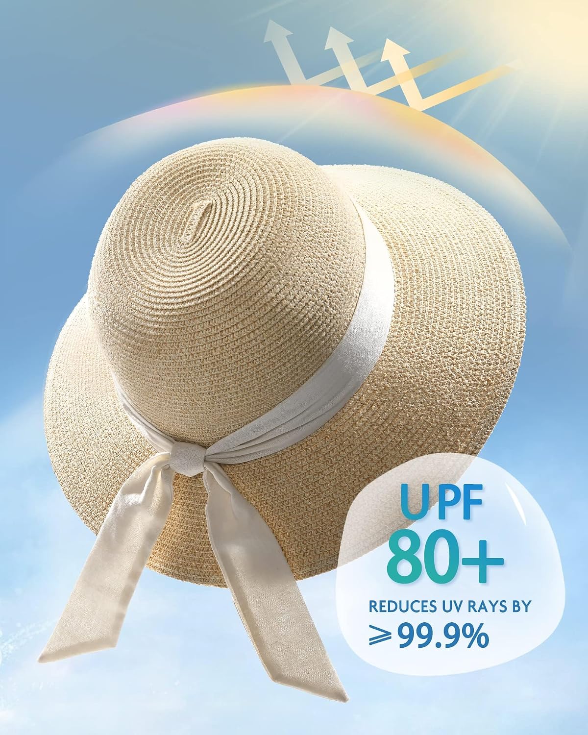
Straw and woven textures (parisisal, toyo, paper straw) have natural light-trapping geometry. The individual fibers catch shadow between them, which makes the hat read darker in real life than in a flash-lit product photo. A “beige” straw hat will often arrive one notch darker than the listing suggests — reviewers of the FURTALK range frequently note exactly this pattern, with one reviewer observing that their beige mix arrived “a little darker than I wanted,” while also noting the practical upside: it hides soil better. That’s a useful pivot — when a color disappoints, material properties may be working in your favor in other ways.
Felt photographs deceptively flat. The nap (the directional texture of the compressed fibers) creates visual depth and color variation that a studio photo rarely captures. A photographed charcoal felt fedora may look uniform grey online; in reality, it shifts between warm and cool grey depending on light angle. This is generally a pleasant surprise — felt photographs worse than it looks in person.
Organza, silk, and structured synthetic fabrics used in fascinators and occasion headpieces are the highest-risk category for color representation. Because these materials reflect light so strongly, product photographs tend to show the highlight color rather than the true base. Navy reads royal blue. Deep burgundy reads bright red. The Cut’s analysis of color accuracy in fashion e-commerce notes that reflective fabrics are consistent outliers in color accuracy testing — and fascinators, which are often photographed against white backgrounds with directional studio lights, amplify this effect.
Satin ribbons and bands on otherwise matte hats deserve specific mention: satin elements almost always photograph two to three shades lighter than they appear in real life, which can throw off the perceived overall color of the hat even when the felt or straw body is accurately represented.
The Decision Framework: Before You Order
If your hat color needs to coordinate with a specific outfit — a mother-of-the-bride dress, a Derby fascinator look, a bridal party accessory — build these verification steps into your process before you click purchase.
Step 1: Screenshot the product photo and check it in multiple viewing environments. Look at the same image on your phone, your monitor, and ideally in sunlight. If the color looks dramatically different across screens, you’re seeing monitor variation, not a stable color read. The color that appears in full sun is usually closest to the real-life result.
Step 2: Search the SKU name plus “in person” or “arrived” in reviews. Buyers who photograph their hat after unboxing or mention how it looked in natural light are your best evidence. Review language like “much darker than shown,” “lighter than expected,” or — valuably — “even prettier in person” gives you real-world color data that the product photo can’t.
Step 3: For blues and jewel tones, request a secondary photo from the retailer. Many independent hat retailers and millinery boutiques will send an unretouched phone photo under natural light on request. It’s worth one email. Vogue’s guides to occasion dressing consistently emphasize the value of working directly with small retailers for exactly this kind of fit-and-color verification.
Step 4: Order against the right reference. If you’re matching to a dress, don’t reference the dress photo — hold the actual dress fabric under daylight and describe that color in your search, not the color name on the dress’s product listing. Color names stack errors.
Step 5: When the color stakes are high, order two options if the retailer’s return policy supports it. This isn’t indulgent — it’s a rational hedge when you’re investing in a $200+ piece for a non-repeatable occasion. The math: two-day shipping and one return is almost always less costly than wearing a hat that reads wrong in photos all day.
When Your Hat Arrives the Wrong Shade
You’ve opened the box. The color isn’t right. Here’s the decision tree.
If the hat is otherwise well-made: Don’t reflexively return it. Walk it to natural daylight and compare it to your outfit. Photograph both together with your phone camera in auto-white-balance mode — this is a more accurate color reference than either item looks in isolation. Reviewers of the Lisianthus soft pink fascinator note that the hat was “even prettier in person” than its online listing suggested; the color surprise ran positive because the buyer evaluated with fresh eyes rather than against an expectation.
If it’s off by a shade but not a hue: Consider whether the secondary details (ribbon color, trim, band material) are close enough that the overall look coordinates. A hat that’s a touch darker than expected may pair better with your outfit’s shadow tones than the lighter version would have.
If it’s off by an entire hue family: Return it. A navy that arrived purple, or a blush that arrived coral, is not a rounding error — it’s a different color. Most reputable hat retailers have return windows long enough to accommodate this, and a clearly documented color mismatch is a straightforward return case.
If it’s a customs or final-sale purchase: Accept the lesson and shop differently next time. For non-returnable items, pivot the pairing — build the outfit around the hat you have, not the hat you ordered.
Frequently Asked Questions
How do I know if the hat color I see online will match my outfit? You can’t know for certain — but you can reduce the risk. Read reviews for real-world color language, view the product image across multiple screens and in sunlight, and if possible, contact the retailer for an unretouched photo. Warm neutrals and black are safest; blues and reflective fabrics carry the highest mismatch risk.
Which hat colors are safest to order without seeing them in person? Camel, tan, cognac, and true black are the most reliable blind buys. Ivory and cream are generally safe but watch for undertone variation (warm vs. cool) in product photos. The Cut’s reporting on fashion color accuracy consistently places warm neutrals as the category least affected by photography and monitor variation.
What should I do if my hat arrives the wrong shade? Evaluate it in natural daylight before deciding. Check whether the variation is a shade difference or a full hue shift. A shade darker or lighter may still work; a completely different hue is a return.
Are navy and dark blue hats consistently misrepresented online? Yes — this is one of the most documented patterns in hat reviews. Dark blues photograph lighter because of studio lighting and reflective fabric effects. If a navy hat looks royal blue in the product photo, expect something significantly deeper in real life.
Is it worth ordering two colors and returning one? For occasions where color coordination is non-negotiable — bridal, Derby, gala — yes, absolutely. The cost of a return is almost always lower than the cost of wearing the wrong color at an important event.
How does material type affect how a hat color looks in real life vs. product photos? Straw and woven textures tend to arrive darker than photographed. Felt arrives with more tonal variation than photos show (usually pleasantly). Organza and satin elements consistently photograph lighter than they are, making fascinators and reflective pieces the highest-risk category for color accuracy.